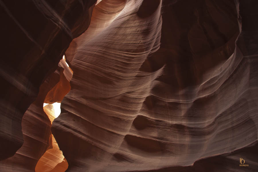
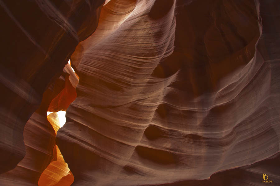
A little bit about Photoshop technique today, a new trick I’ve applied recently. For those who aren’t mildly interested, I’ll leave the technique description to the end. What I show first are two versions of the same photo, one with very little post processing and the second which I’ve treated using saturation and luminosity masks.
The photo was taken in Antelope Canyon, near Page, Arizona. The canyon is referred to as a slot canyon, very narrow relative to its height.
Antelope Canyon was formed by erosion of Navajo Sandstone , primarily due to flash flooding and secondarily due to other sub-aerial processes. Rainwater, especially during monsoon season, runs into the extensive basin above the slot canyon sections, picking up speed and sand as it rushes into the narrow passageways. Over time the passageways are eroded away, making the corridors deeper and smoothing hard edges in such a way as to form characteristic ‘flowing’ shapes in the rock.
Flooding in the canyon still occurs. A flood occurred on October 30, 2006 that lasted 36 hours, and caused the Tribal Park Authorities to close Lower Antelope Canyon for five months.


You should note that the second photo is brighter (more luminous) and that its colours are more vivid (more saturated). I did not create any colours in this photo, the techniques I used enable me to better draw out the colours captured by the camera. The purpose of these adjustments is to make the scene appear more like the human eye would see it. Camera lenses can get you most of the way, but they’re not as effective as our eyes in their ability to discern subtleties of colour and light. We all have our preferences; decide for yourself which of the two you like better.
Here’s where the technique stuff starts. If you’d like to go do something else, now’s the time.
Masks are used in Photoshop to enable the user to hide or display specific parts of an image or to work selectively on a specific part of the image. Luminosity and saturation masks are as their names would suggest, masks that enable you to work selectively on very specific light levels and very specific colours, respectively. I was introduced to the technique about a year ago by fellow photographer, Bill Smith. He referred me to another talented photographer and creative Photoshop user, Tony Kuyper who explains the technique and makes available downloads of his masking “actions” on his website http//www.goodlight.us. You can find access to Tony’s site directly under “References” at the bottom of this post.
Both photos were given a cursory adjustment in Adobe Camera Raw to improve exposure and sharpness. I applied both luminosity and saturation masks to the second image in an attempt to make it more visually appealing. I used a luminosity mask to diminish the intensity of the shadows and to increase the brightness of the highlights in the image. The mask enables me to work on these very specific elements of the image without affecting anything else. I then used a saturation mask to selectively increase the intensity of colours that were not well saturated in the original image.
I have been using the luminosity masks since I first became aware of them, last year. I have just recently begun using the saturation masks, taking advantage of Tony Kuyper’s recent release of an improved version. I’m happy with my early efforts and hoping to become more skilled as I gain experience with them.
