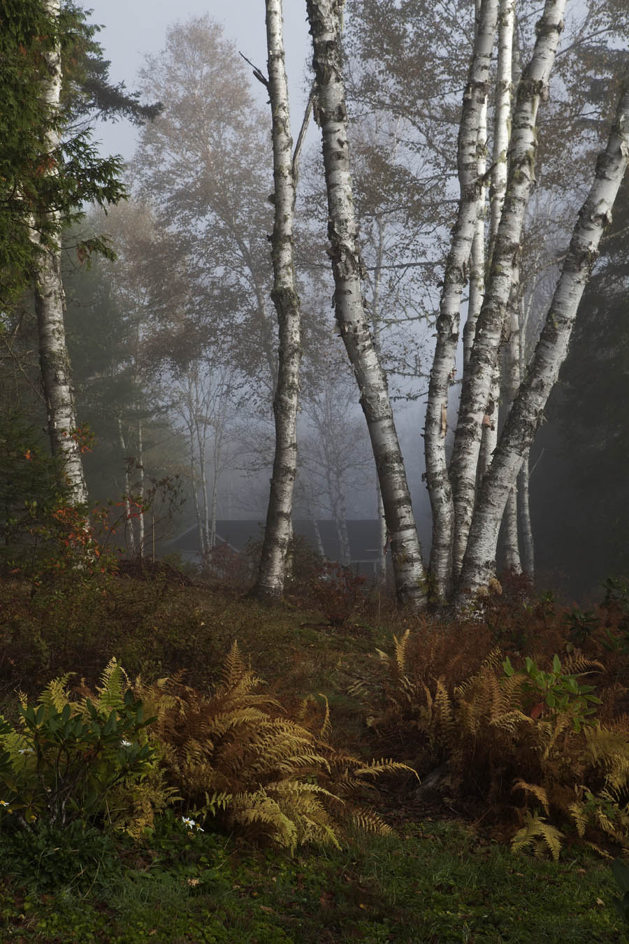
Today’s post features two pictures from my recent trip to New Brunswick. These pictures were taken at the home of one of our workshop leaders, Freeman Patterson. It began as a misty day, a great backdrop for photographing colourful autumn scenery. The first picture is one of a stand of birch trees, with a patch of colourful ferns in the foreground. I’ve adapted a technique taught to us by the other leader, Andre Gallant to create a different look to this scene than I got with the initial image.

Here’s what I did. Using Photoshop, I created a duplicate layer of the picture atop the original and converted it to black and white. I was then able to blend the colour and the black and white layers to produce the final image. It’s darker, more shadowy and has moderated the hues of the fern and birch leaves. So, what’s different from simply making it darker? The answer lies in the tonality of the black and white image. Black and white images can vary considerably in their tone, the degree of lightness and darkness. A black and white image consists of the same red, blue and green colours as a coloured image but one or more these will be absent or very faint. Different combinations produce markedly different degrees and distribution of light and dark. By blending, the tonality of the black and white image alters the tonality of the resultant coloured image correspondingly. It’s not a uniform lightening or darkening across the image. I tried a few different styles of black and white and I chose the one that produced “Birches” as you see it.
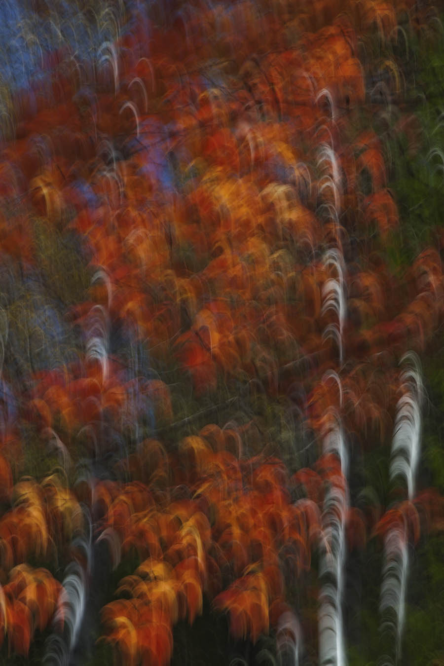
The last one today is an abstract, using a technique taught by Andre Gallant. It’s as simple as slowing the camera’s shutter speed (1/8 sec works well) and shifting the camera to achieve a blur. The nature of the blur depends on the movement you choose to make. In this case, I used a “swoosh” movement, the shape of the Nike emblem. You can see it as the little hook shapes (white in the tree trunks). I turned up the saturation to accentuate the red, yellow and orange hues, applied a little “glow” and finished the image by again blending the original with a black and white to alter the tonality. The title tells you it’s trees if you have any difficulty seeing it.

