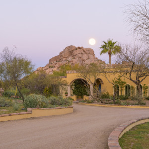
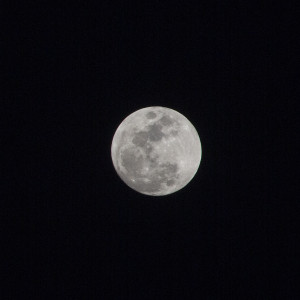
Photographing the moon, particularly the full moon can be difficult. The challenge arises from the moon’s brilliance. To capture the moon without over-exposing (and washing it out), the shutter speed must be short (<1/100 sec). At high speed, in low light or darkness, it’s not possible to capture anything but the moon. The remainder of the scene is very under-exposed and not even visible.
The photo on the left was taken with a relatively long exposure; the photo on the right with a much shorter exposure. You can see that the moon is over-exposed in the scene to the left. In the picture to the right, all but the moon is under-exposed. The photos were taken with two different lens, a wide angle for the photo on the left and a telephoto for the picture on the right. That way, I get a larger, better detailed image of the moon to work with.


A way around the problem of vastly different exposures is to combine them into one photograph. The technique is called compositing and it can be accomplished using the layering feature of Photoshop. The two photo files are stacked then merged to achieve the desired result: a visible scene and a clearly defined moon. The photos must be taken using a tripod, for stability of the long exposure and to facilitate lining up the two images in Photoshop.
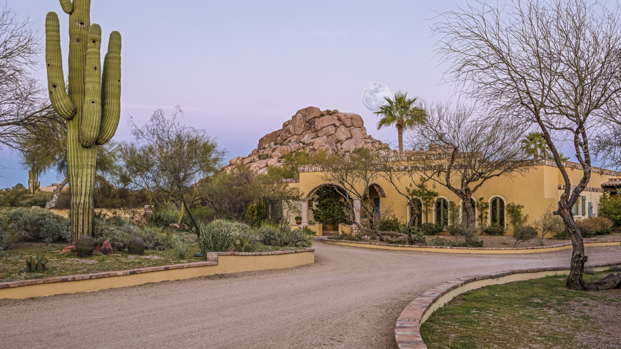
Here’s what the outcome looks like. This scene features a hacienda-style home in nearby Carefree (adjacent town) with the landmark for the Boulders Resort in the background. I’ve located the moon just above the boulders and partly obscured by the palm tree. The photo of the moon is in the layer behind, with only the moon itself allowed to show through. The challenge with using two different pictures, with two different exposures is to make it as realistic looking as possible.

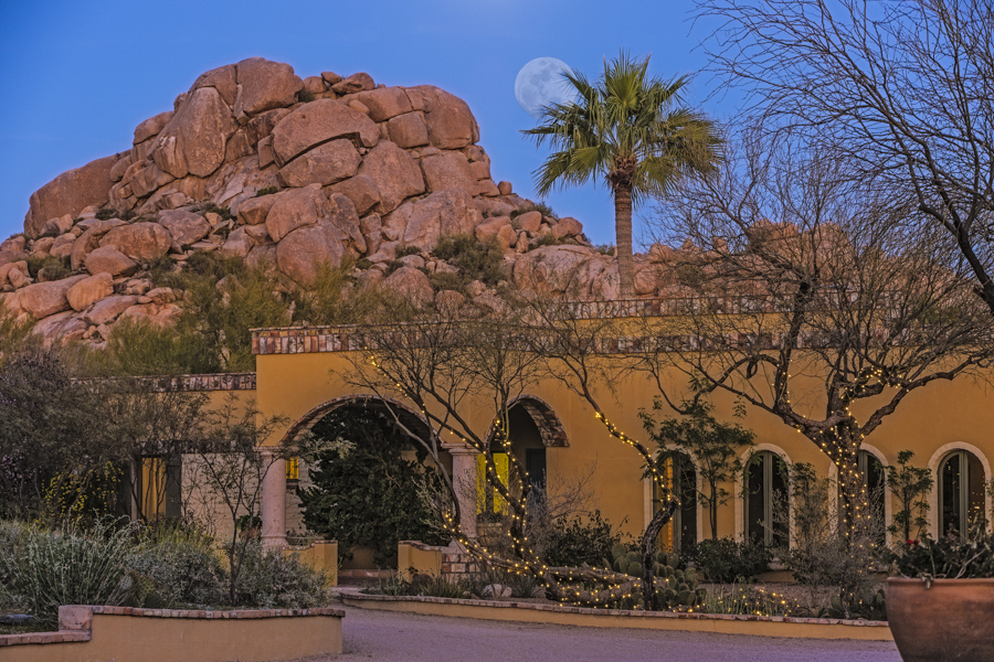
I prepared one additional image, this time using a telephoto lens for both photographs. I did this to get a close-up view that better displayed the details of the house and gardens. The exposure is darker and I reduced the opacity of the moon as well in an effort to achieve a more realistic look. I like it better.


I enjoyed the photos, Peter, but the commentary/instruction is particularly well done, and I thank you.